Here’s Your Guide to Getting the Ideal Website Layout

Article by Beatrice Aranton
Graphics Design by Kirsten Tumbokon
In coming up with the ideal website layout for your company, think of it as the first impression your business makes to potential clients. Does your website clearly show what your business services and products are? Is it aesthetically pleasing to the eye and does it make it easy for your visitors to course through? If not, then you may lose potential customers even before they see what you have to offer.
Of course, you might have a vision of what your ideal website looks like; one that is quick to bait the eye of your web audience and just as quick to drive customer conversions.
So the question now is, how do you achieve the ideal website for your business?
Before you start thinking about website designs or the things that you want your customers to see in it, it’s important to first describe what kind of website your company needs. Keep your brand image in mind as you go through the whole process.
Read on to find out about the 5 simple ways that can help you achieve the ideal website layout for your business!
5 Ways to Create Your Ideal Web Design Layout
1. Clearly present what you’re selling

There is no quicker way to let your website visitors know what you market than saying it directly.
Of course, every company has its own market position, and you could put yours right on the first page of your website in the form of a powerful one-liner that clearly tells users what to expect from your website. Twitter is just among many examples of companies explicitly showing their goals through a tagline. With “See what’s happening in the world right now” summing up their services on their home page, people can expect that this website provides all kinds of information from all over the globe.
This could also take the form of creating visuals like logos, graphics and other page designs that could already visually help your website visitors know what you’re trying to sell. Throwing in a crisp and clear copy that effectively gets your marketing message across in a concise way also helps your potential customers remember your message better.
2. Treat each component more than just a part of a whole
“The details are not just the details. They make the design.”
This saying applies in so many aspects of life, but it also weighs importance when it comes to the process of developing your website. Although your website is the final output and is, generally, judged and viewed as a whole, it is still good to work under the pre-assumption that each component of a website should be able to stand on its own. Akin to each piece of a puzzle, each element, no matter how small it may be, carries its own significance that contributes to the overall success of the website and your business. Be sure to pour equal effort in designing your logos, graphics, copy, and your web content as all these have a role in catching the eye of your prospects.
3. Ensure brand consistency with a visual identity

Your website should be equipped with the right tools to make it stand out in the eyes of your target audience. Various design elements can help give you an edge in your industry, but consistency with your look can help your customers remember your brand better.
Below are the things you should carefully consider when going over the process of your website:
- Color theme
Another example of this is the use of colors. Say you own a hospital, its website should emanate elements that would symbolize health. In color psychology, health can be represented by red, as used by Red Cross; blue, symbolizing sterilization or cleanliness; or green, which is the color of life. Colors can represent great many things, which you can use to interpret your brand and convey one message all throughout your website.
- Typography
Fonts also depend on what and who your target audience is. You have to gauge how the demographics of your audience can best respond to how you present your content.
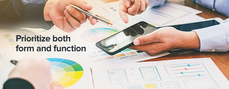
4. Prioritize both form and function

In architecture, “form follows function” is a belief that in coming up with designs, functionality is the top priority and aesthetic is secondary. But in web design, it’s essential to focus on both. Develop your website through the eyes of your visitors; put yourself in their shoes and try seeing it yourself if building your site the way you see it helps them get to what they are looking for without any difficulties.
If you want your website to be unique, then don’t be afraid to stray from the usual designs. After all, your marketing goal is to be able to stand out among your competitors in the industry. So, allow yourself to experiment with new trends and don’t be afraid to mix and match new elements together.
5. Give your brand some personality

When all is said and done, the key to winning the attention of your target market is to stay true to your brand. Helping your customers relate to your brand by being transparent about your image and letting it shine through your designs is one of the best ways to truly communicate with them. It shows credibility and it conveys the message that your brand is genuine.
Employ these web design practices to achieve your ideal website with Gotafflair
Here at Gotafflair, we believe that creating designs that truly resonate with your brand can have a huge impact on the success of your business. With our creative experts in design and web copywriting, we can walk you through these best practices and help you in attaining the website that perfectly represents your brand.
Connect with us anytime at 798 8195 or contact us at sales@gotafflair.com for a free consultation!


