7 Ways Color Psychology in Web Design Can Drive Conversions
Article by Beatrice Aranton
Graphics Design by Ryan Rivera
In gauging a website’s success, most businesses see conversions as a clear indication that their website is doing well. Just like how user experience and user interface design undeniably play a huge role in a web site’s success, color psychology also makes a potent web design tool.
Color Psychology In Web Design
All websites aim to catch each visitor’s attention and evoke specific emotions and reactions. Colors have proven over time their usefulness in conveying messages, either positive or negative ones. They tap into the human subconscious and generates optimal responses which is what eventually drives sales. Read on to see how each color evokes emotional responses from your target audience!
1. Red
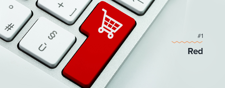
Red can be a stimulating color because it communicates a sense of urgency. If you have an eCommerce website and you’re promoting a sale, using red in your ads and graphics will immediately draw attention. Additionally, red entices the reader to complete the interaction while instilling the fear of missing out, making this color highly popular for eCommerce websites promoting sales materials. In designing websites, use the color red judiciously to grab the browsers’ attention, and add supporting copy along with relevant imagery.
2. Blue
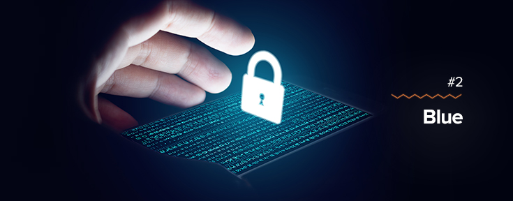
In some countries, blue is seen as a color for mourning. Thus, it is a denotation of sadness. But in web design, blue can represent dependability, intelligence, safety, and trust which makes it popularly known in the business world, particularly in financial sectors. Many people also find blue to have soothing qualities that relaxes the readers. Logos and web design palettes made for some industries where a high level of trust is mandatory such as insurance or cybersecurity companies widely make use of the color blue in their marketing materials to establish the message of safety in their brands.
To communicate credibility, you may use vivid blues, and if your goal is to relax your audience then you may use softer hues of blue. Rest assured that trust and relaxation can and will help your web design drive conversions.
3. White
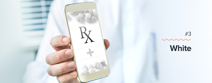
The color white denotes order and organization, traditional values, along with purity, innocence, and virtue. White also represents cleanliness which is why the healthcare industry vastly makes use of white on their websites. But the healthcare industry is not the only industry that utilizes the color white to garner the trust of their target audience; the majority of news websites also use white to recall the sense of trust people feel when reading newspapers.
Using white on your website lets your content stand out, communicating to your readers clearly what your message is while fostering the feeling of honesty that can effectively result in conversions.
4. Black
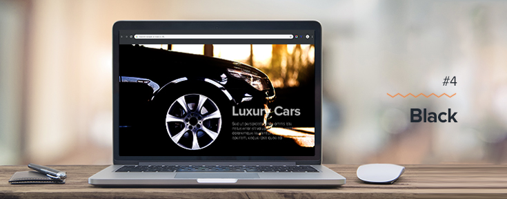
When you think about darkness or death, no doubt that the first color you associate with these things is the color black. But advertising nowadays paints the color black in a more positive light, earning it a reputation for being elegant, sleek, and glamourous. Luxury brands commonly use black in their ads because it projects dominance and power.
Create sharp contrasts in your web page elements using black then use vivid colors to achieve that sleek and modern feel. Browsers are sure to convert once they see the eliteness of your brand or product.
5. Yellow
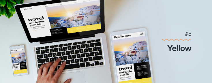
For an optimistic, warm and youthful feel, yellow is the right choice. The color yellow has a playful vibe that can be associated with brands that aim to look friendlier or more approachable to their customers. The websites that often use yellow in their design are businesses related to parenting, travel, or wellness.
You may use yellow to make your brand warm and welcoming. The use of too much yellow can be quite overwhelming, so consider matching yellows with neutral palettes to liven up the design while maintaining the professional look and feel of your website.
6. Green
Green has always been the go-to color for anything associated with the environment. This color recalls the feeling of being outdoors, the season of summer, healthy foods, as well as overall wellness. Most businesses with corporate social responsibilities or environmental causes showcase a green theme on their websites. And just like blue, green is easy on the eyes which is why incorporating hues of green on your website is an excellent way to put your visitors at ease.
Green also elicits a sense of decisiveness, so make use of the color green to make your readers feel that purchasing your products or services is the right choice and can make everything better.
7. Orange
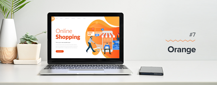
Many businesses use the color orange when putting CTAs in their websites. The logic behind this is that orange is a combination of red and yellow, the two colors that give off the feeling of warmth and cheerful welcoming as well as a sense of urgency.
Additionally, like the color red, orange can be associated with fire and passion, just without the negative associations. Orange also works well with neutral palettes, so use it on your website and other marketing materials to catch the eye of your readers.
The emotional associations with various colors can also vary according to culture, personal experience, and other factors. It’s important to have a deeper understanding of your target audience so that you don’t choose a color that will garner the opposite reaction from your intentions.
Here at Gotafflair, our team of creatives believes that color psychology principles as a design tool help give you a better idea of how colors can affect human beings and help you compel the right reactions in the majority of your market. Once you have a stronger understanding of how each color conveys values, emotions, and attitudes, you can use color psychology strategically in your web design to boost your conversions.
Learn more about what we can do for your website’s content by getting in touch with us for a free consultation! Contact us at 7798 8195 or email us at sales@gotafflair.com today!


