Top Eleven-gendary Elements Essential in Every Homepage of a Website
Article by Nicole Serrano
Graphics Design by Jericho Ramos
A website’s end goal or purpose is to communicate your brand and market your products and services. The homepage is the primary landing of a website, giving you the first impression of what to expect in the rest of the pages. This is the oldest URL of your website, which means it gathers the most visits making it the most important part of your site.
As such, it needs to be attractive enough to get attention, easy to navigate with, gets the point across, and eventually, turn visitors into potential leads and customers.
Not only should it showcase what your company can do or offer, but it has to be able to communicate your branding personality in order to resonate with your audience.
Each website has constant key elements that are essential in the design and structure, to emphasize the value proposition of your brand. Such elements make up the backbone of a website’s homepage. They say the attention span of a visitor lasts up to 8 seconds, so you need to make sure that you can get them interested within that time frame.
Anatomy of An Excellent Homepage
1. Logo
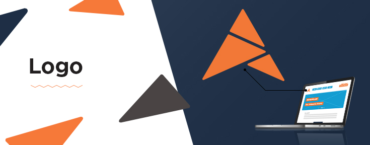
Your logo represents your brand identity. It should be easily seen as soon as someone visits your website. Usually, it is linked to your homepage so that whenever your browsers roam around your site, they can easily click the logo and it redirects them back to the homepage.
The importance of the logo being visible in all pages of the site is that it communicates your brand values and serves as your identity mark. Size and placement also affect the way that it is presented and aligned with the overall design and structure.
2. Rotating Banners
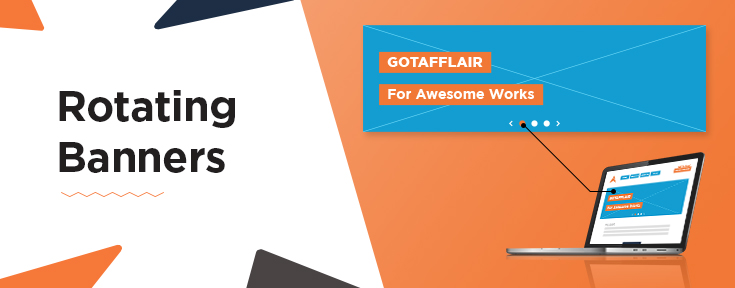
The banners have the highest heat map for browsers hence, it should be designed and taken advantage of to captivate attention and interest. Since it’s located above the fold of your site, it needs to be attractive and should highlight your brand’s purpose. The use of high quality photos make a great impact on the overall design and by having multiple rotating banners, there is variety in what you can display.
3. Banner Taglines
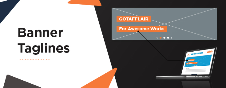
Banners often come with taglines or slogans that can be modified to drive browsers into the important pages of your site. It should not only complement the banner images but should also pique the visitors’ interest, enough for them to continue browsing the website.
4. Main Navigation Menu
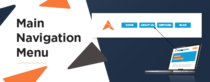
The horizontal or vertical menu bar you find in websites is referred to as the navigation menu. This consist of the key pages in the site, with some having sub-menu items that are displayed in a drop-down menu format. Such a feature enables navigating around the website to be more intuitive, logical and easy for browsers to locate what they are searching for. It keeps things organized and well-structured, for better user experience.
5. Welcome Message
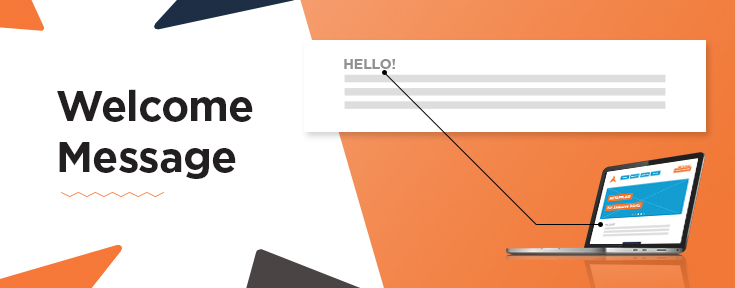
The Welcome Message is often placed above the fold of the website and serves to introduce yourself or your business. This can be a brief excerpt of your company profile or a short intro to communicate the purpose of your site. Since you only have a few seconds to grab your browsers’ attention, your homepage should be easy enough to skim that it displays the information they need to know.
6. Contact Details
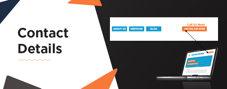
Placement of contact details is very important because you would want your browsers to immediately know how to get ahold of you. Make sure to put it in an easily accessible and noticeable section of your site. That is the golden ticket into getting people to become potentials leads or customers, so don’t give them a hard time in looking for your number or email address. An effective placement is often on the upper right side of the website.
7. Call-To-Action
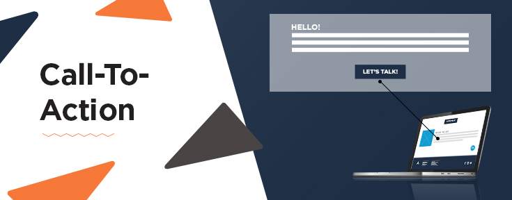
Call-to-actions shouldn’t be limited to phrases like “Call us!” or Contact us now!”. Instead, they can be customized to fit your business industry or to get them to engage a specific action in your website. Do you have a newsletter? If so, then you can put “Sign up for free for our weekly newsletter!” Or, maybe you want people to know that you ship for free nationwide? A “Free Shipping!” sign would entice your visitors and make them want to buy from your website.
Bottom line is that a good website should be able to get visitors to convert into buying customers. In order to do that, you need effective call-to-action buttons to convince them to engage you.
8. Overview of Products/Services
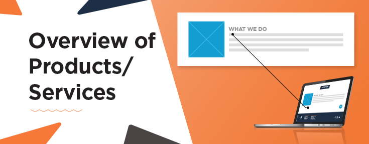
What is your business all about? What can your customers get from you that they can’t get elsewhere? What sets you apart from your competitors?
Your website visitors should be able to immediately know the value proposition of your brand from looking at your homepage. What can you offer them to make them care enough to continue reading and browsing through your website? These things are what you should consider as you conceptualize what to include in the overview of your products and services. There is no need to display everything in the homepage because you can have a separate page for that purpose. The focus should be on the products and/or services that showcase your unique value proposition.
9. Site Footer
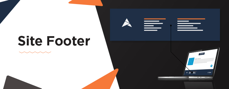
Similar to the main navigation menu found above the fold, the site footer also includes important navigation links consolidated neatly below for easy viewing and access. A site footer serves as a reminder as this may be your last chance to get your visitors’ attention. Look at it this way, a visitor who scrolls down to the bottom of your website is obviously looking for more information.
10. Social Media Buttons
Having a social media presence nowadays is important for businesses especially when they want to engage a wider market. Cross-channel promotion is effective in expanding your following and promoting marketing content to your potential leads and customers. Including social media buttons or icons in your homepage lets your visitors know that they can also check you out in your social media pages. This also makes it easier for them to get back to you in the future since they are most likely active on social media. You can either place these in your footer or on the upper right side of your website near your contact details.
11. Back to Top Button
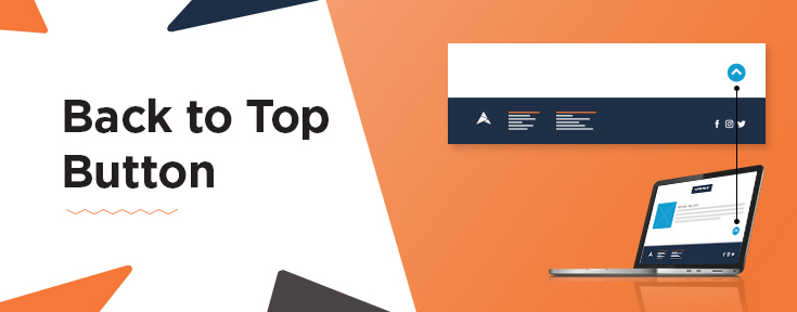
A back to top button is a navigation feature that allows you to easily return to the top of the page. This is highly recommended for websites with long pages because it saves visitors the time and the struggle in having to manually scroll back up. Close attention to details make a great impact and improves the overall user experience of a website.
Conclusion
A website’s homepage is the most important part of your website. It should be seen as a different entity and must be able to get your value proposition and purpose across your browsers. It is best to customize the design and think with your consumers in mind. It should be tailored to guide and influence users to convert into customers. As such, certain elements are vital to be an effective website.
Gotafflair for Web Design Services in Manila

Looking to start a website for your business or are you interested in revamping your current one? We’ll help you get started! Contact us at 798 8195 or send us an email at nicole@gotafflair.com for a free consultation!


